DESIGN
Pictured above: The National High School Journalism Convention student publication display, where I spent time flipping through print editions from schools across the country and talking with other student editors about design choices. I was especially inspired by St. Mark’s School of Texas’ The ReMarker, which used a distinct color theme for each edition. I brought that idea back to our newsroom and designed our next issue around a light cyan blue palette. I also loved U-High Midway’s glossy paper and long vertical format. The display was one of my favorite parts of the convention because it allowed me to connect with other student editors and even engage in friendly debate about what makes a publication work visually.
DESIGN APPS I'M FLUENT IN:


MY CANVA TEMPLATES & DESIGNS

DROP-IN TEMPLATES | MULTI-USE DESIGN FOR STAFF
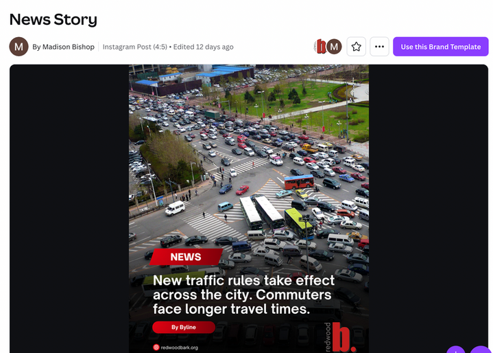
As this semester’s Social Media Editor for The Bark, I changed the role from “manager” to “editor” to keep up with a digital-first newsroom. I designed and launched reporting-for-social-media Canva templates. The templates cover sports, news, features, and lifestyle stories. To keep things consistent and easy for staff, I made each one ready for "drop-ins", so reporters can copy, paste, drop in their photos and text, and have a post ready to go in minutes.
MY TEMPLATES-IN-ACTION

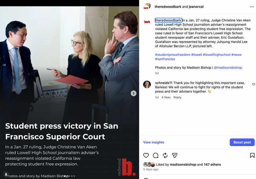
I used the templates regularly in my own posts to show staff how they worked. Once people saw them posted and noticed the engagement they were getting, others started using the templates too. Leading by example helped the system catch on quickly.
Now, our 100-student staff uses my templates and our feed looks like this:


Additionally, I've stepped in during periods of high newsroom demand when designated staff illustrators, multimedia designers or artists were unavailable, creating original featured designs for both our online and print content.
Dominance. Contrast. Eye Flow. Balance.
I organized my designs by the primary principle it demonstrates most clearly: dominance, contrast, eye flow or balance. While many designs use multiple principles, I grouped each one where it is strongest and most intentional.
DOMINANCE
One clear focal point
 I used a cut-out style and dark background to make the performer the clear focus, matching the energ |  I used pose, size and the "popout" feature to make the dancer the main focus. |  I used the same editing style to push the performer forward while keeping the background figures sec |
|---|---|---|
 I used scale and contrast to center the athlete's expression, not just his uniform. |
CONTRAST
Difference in color or style to create emphasis
 I contrasted simple illustration with bold text to sharpen the satire and make the message clear. |  I used vibrant colors against a neutral background to separate counties and make information readabl |  I emphasized certain text with font and made the main interview subject the center, larger focus. |
|---|
EYE FLOW
The design guides the viewer
 I used pop-art to make a Valentines' theme review section header. |  I used arrows and boxes to guide the reader. |  I designed the timeline left to right. |
|---|
BALANCE
Visual weight is evenly placed
 I used symmetry to balance portraits and text. |  I balanced text with photos and graphics. |  We spaced the bottles evenly for balance. |
|---|
Inside Look at my FAVORITE TOOLS

CANVA Background Remover
Isolates subjects for dominance, used for my Backstage Pass style thumbnails.

Canva Spacing
Used in the SNAP 2025 Timeline to keep text and icons evenly spaced and easy to read.

CANVA Position
I used Position to center the athlete and layer text behind and in front of the subject.

ThingLink Hotspot
Used in the Clickable Bay Area Map of CalFresh Offices to add interactive hotspots, letting viewers click on counties for more information without crowding the design.

INDESIGN Text Wrap
I used InDesign’s Text Wrap tool to make the text flow around the image and infographic, which keeps the spread clean and easy to read.

Canva Color Picker
Used in the SNAP graphics set to keep colors consistent across the flow tool and timeline.

PICSART Cutout
Cleans up edges of items for clear, more precise structure.

PicsArt Shapes
Used in the Daily Show interview graphic to emphasize names and quotes without breaking layout consistency.


